Coot Club
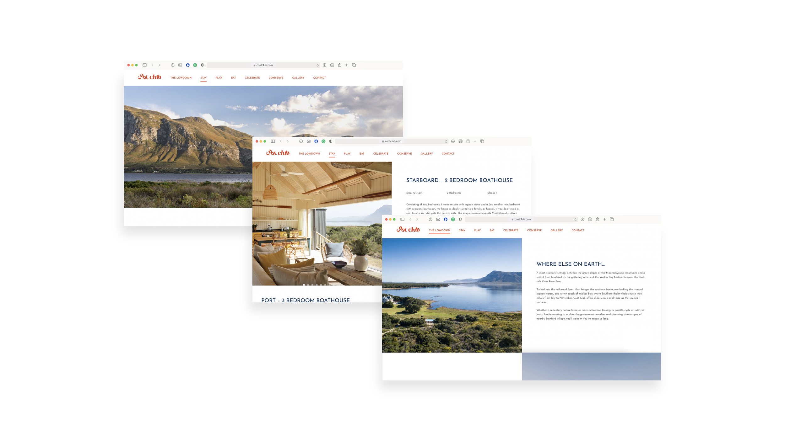
Brand Visual Identity | Corporate Identity | Website
Year | 2022
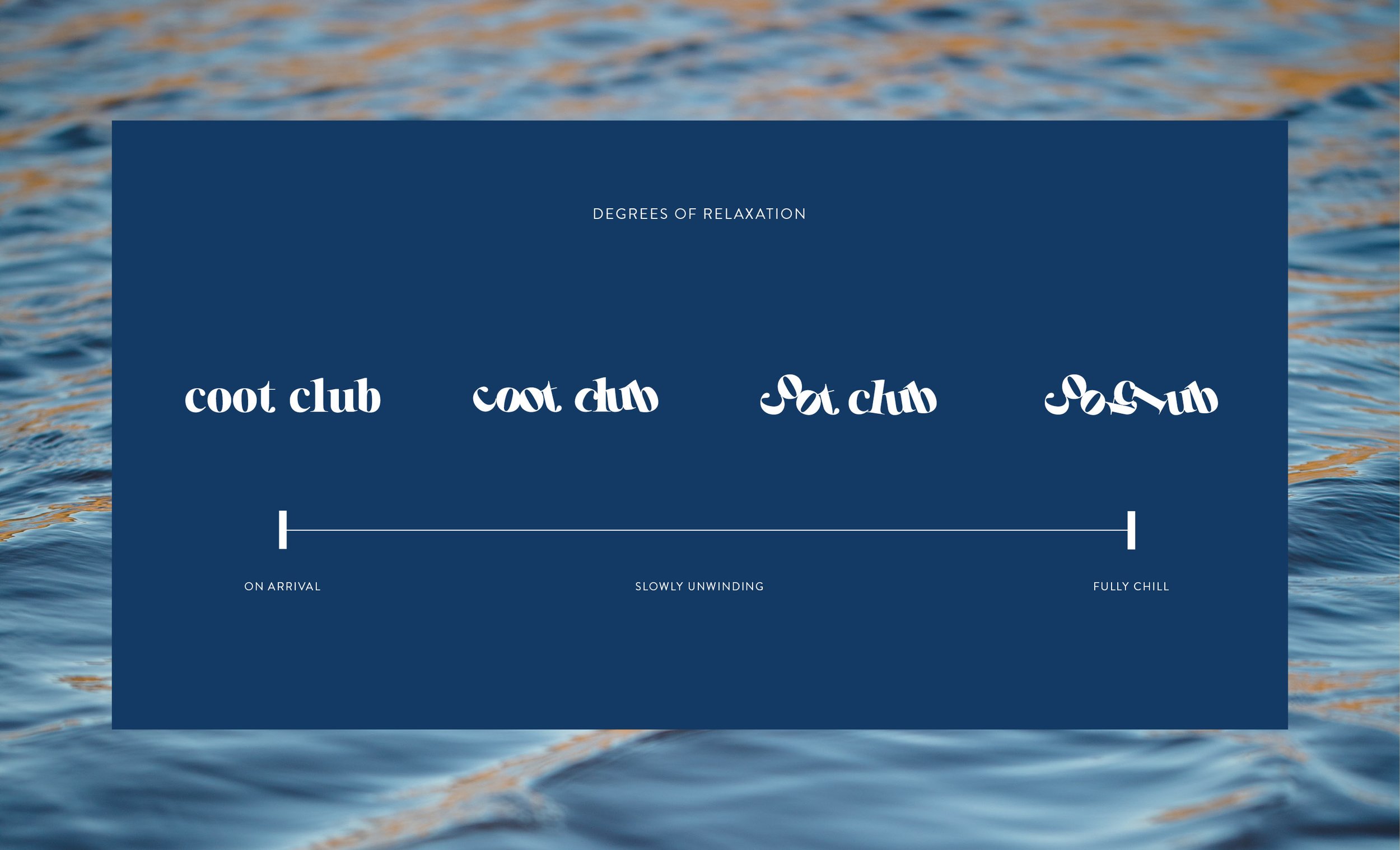
Coot Club is a boutique resort outside Stanford, South Africa that stands for one thing, and one thing alone. Letting go. Letting go of stress. Of technology. Inhibitions. Work, emails, and things to do around the house. The challenge was to create an identity that could be used throughout the resort that reflected Coot Club’s philosophy at its core.


The wordmark’s letters have let go - as one should when arriving at Coot Club. They have quite literally fallen from and out of the lines that restricted them into mundane conformity. The jumbled heap of letters can resemble a towel left aside the lagoon, clothes that have been thrown to the floor in the thrill of a midnight skinny-dip, or pieces of wood left next to a fire, in preparation for a night with friends.
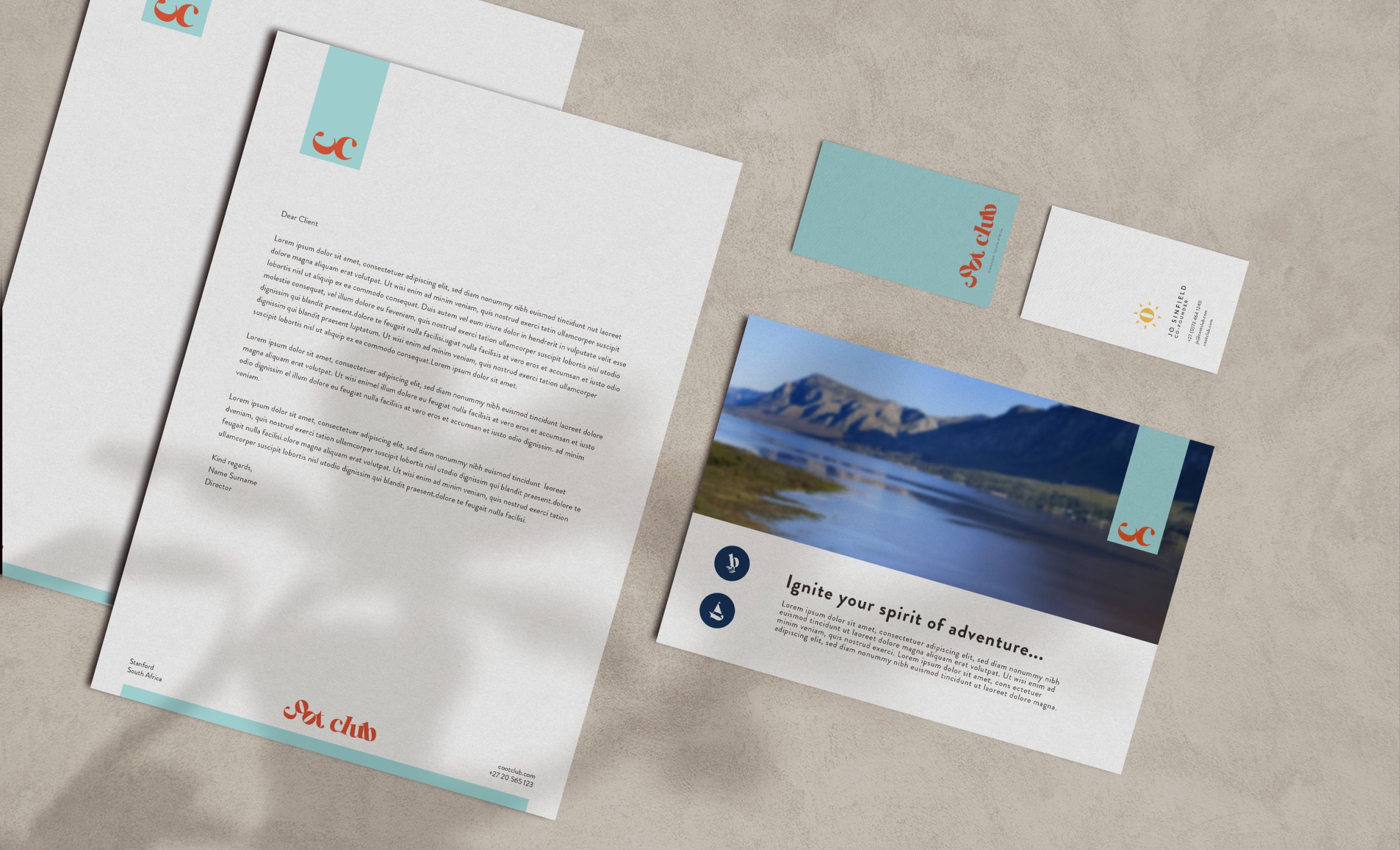
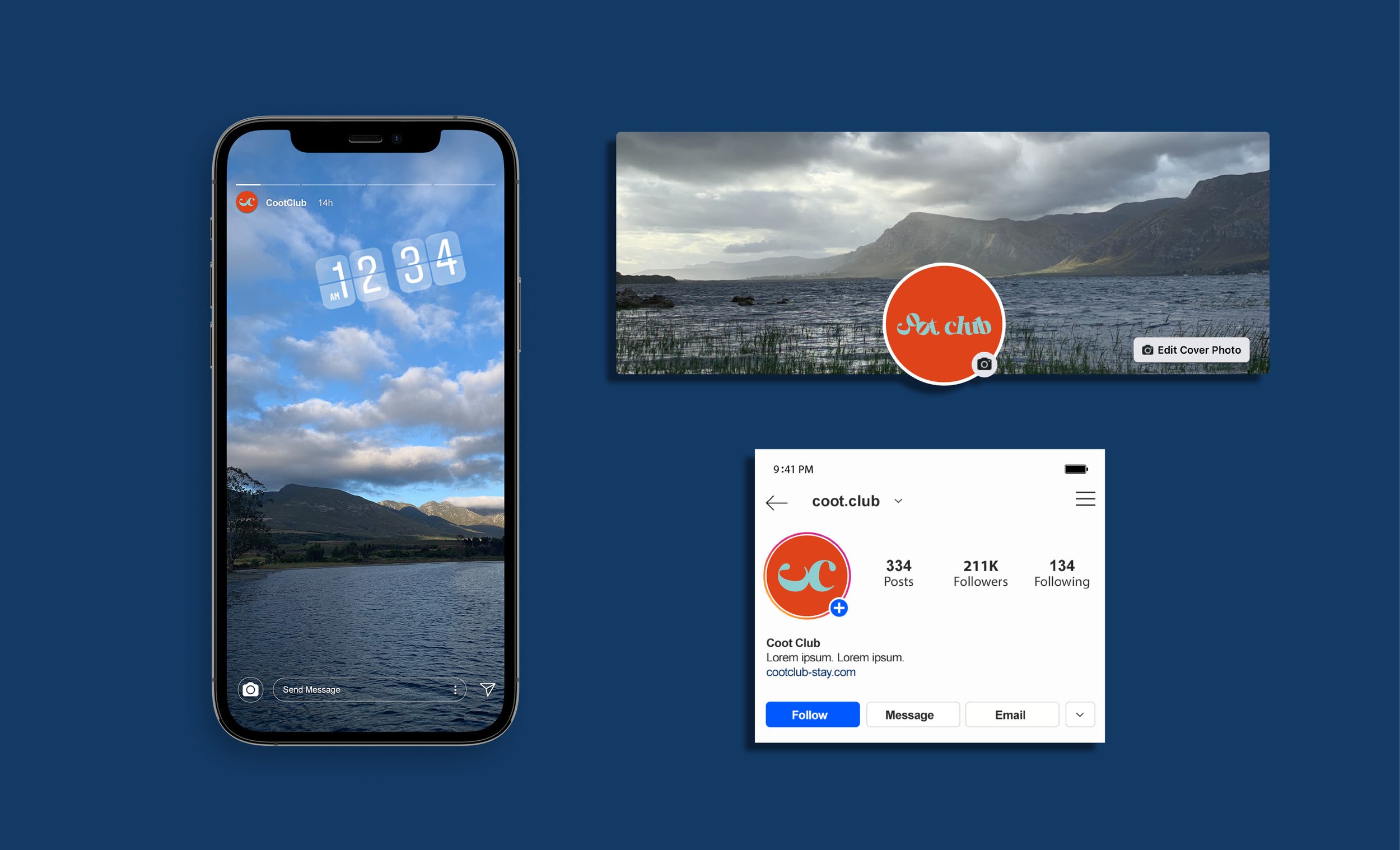
The brand identity is playful - and for all ages. It consists of a bold colour palette of bright sunshine yellow, the deep navy of a midnight starry sky, the red of boat sails and the light blue of the lagoon waters. Letters from the logo were created into illustrations to represent some of the activities on offer.
Creative Director: Saskia Sevenster
Copywriter: Carl Cardinelli
Photoshoot Photographer: Henrique Wilding
Web Development: Pieter Ludeke